 |
|


 Aug 04, 2009, 08:00 PM // 20:00
|
#1 | |
|
Wilds Pathfinder
Join Date: Mar 2006
Location: CA
Profession: N/
|
 The Ego-Killing Thread [CnC here]
Rules:
1. Be nice. This doesn't mean you can't give harsh critiques, but do it in a constructive manner and never attack the person directly. 2. Please refrain from posting useless comments if at all possible. "It's really cute!" doesn't help the artist. 3. Respect the wishes of the artists. It's their work they are putting out there. 4. Don't get defensive about unfavorable critiques. Most likely they are just trying to help. 5. No excuses. All we are doing is looking at your piece and letting you know how it can be better. Please refrain from giving us qualifiers. Critique Form: Use this if you need help getting started :P Quote:
Last edited by BlueXIV; Aug 05, 2009 at 02:02 AM // 02:02.. |
|

|

|
|
Aug 04, 2009, 08:45 PM // 20:45
|
#2 |
|
Wilds Pathfinder
Join Date: Mar 2006
Location: CA
Profession: N/
|
I should probably post the first one, since I made the thread D:.
hmmm which one to pick... We'll go with an old practice portrait  Stage of Development: It's "done." As much as a portrait study will be. Please look at: Lighting and color (?) Harshness: Psh you can't hurt me critiquing a study. 10. Comments/Notes: 40 minute color portrait study. Shame I can't find the original photo... :\ Last edited by BlueXIV; Aug 04, 2009 at 08:47 PM // 20:47.. |
|
|
|
|
Aug 04, 2009, 09:40 PM // 21:40
|
#3 |
|
Desert Nomad
Join Date: Mar 2007
Location: UK/Austria
Guild: [bone]
Profession: P/
|
all right, so I'm going to say what I think to get this thing started
 generally, I really like the use of colours and textures, blending from a light purple to orange/yellowish hues - the roughness is very befitting for a study; the light reflections on the glasses make them look like there's actually glass in there. The only thing that bugs me a bit are the pretty strong, white highlights - while they work well on the hair and shirt, I think they're a tad too much in-your-face for, well, the face  eyebrows are not quite the same colour but love the shadows under the chin and hair. eyebrows are not quite the same colour but love the shadows under the chin and hair. helps? considering that you're infinitely better at painting than I am... :P |
|
|
|
|
Aug 04, 2009, 09:53 PM // 21:53
|
#4 |
|
Furnace Stoker
Join Date: Jan 2009
Guild: [SOTA]
Profession: D/
|
http://i21.photobucket.com/albums/b2...r/tzularge.jpg
http://i21.photobucket.com/albums/b2...zularge_bw.jpg (this is the full-size image, so it's rather large. First one is colored and shaded, second is just the lineart) Stage of Development: Completed Please look at: In particular, I want to know what to work on, in terms of anatomy and proportions. Also if there's any weirdness in shading - I know some of it is awkward, so yeah. Harshness: Err...7 I guess? I don't really care, just don't be like "this sucks and is horrible and blah blah blah" Comments/Notes: This was done entirely digital in Open Canvas. I have never been very good at sketching digitally, and I've basically just started using OC. So the lineart is a horrible mess as I haven't yet figure out brush settings or anything too well, plus my tablet is a piece of crap. Any advice on OC, if anyone uses it? It does seem to like my tablet better than Photoshop does... |
|
|
|
|
Aug 04, 2009, 11:01 PM // 23:01
|
#5 |
|
Krytan Explorer
Join Date: Mar 2008
Profession: N/
|
Verene, since you asked about anatomy, I'd suggest you need to show the passage of her left thigh, I've tried to show it here. (The quick sketch in the top left has the thigh in blue to try and explain better), as it is the leg appears to start at the knee. I do realise you've added shading on the dress but her inner thighs should move closer together as they near her body.
The dress on her right leg suggests that the skirt is about mid-thigh length. If she'd quickly knelt to fire it would feel more natural, I think anyway, for it to ride up her thigh rather than cover her knee. But I can also see the skirt my slope to one side and be much longer on that leg, if so you need to add more volume to it, it would drape down on either side of her leg because of the extra length. The skirt clings to her left leg a little as well, again there may be reason for this but we can't see it if so, I'd suggest it should drape down from her leg rather than follow the contours however that may change anyway if you take my advice about the thigh.  I hope that seems valid, and doesn't make me sound like a complete arse. |
|
|
|
|
Aug 05, 2009, 12:04 AM // 00:04
|
#6 | |
|
Wilds Pathfinder
Join Date: Feb 2007
Location: East Coast
Guild: none
Profession: Me/
|
Quote:
|
|
|
|
|

|
Aug 05, 2009, 12:22 AM // 00:22
|
#7 |
|
Pyromaniac
Join Date: Aug 2005
Profession: Mo/W
|
Verene___
The pose is wrong too, I think. I'm not a archer myself, but if I were to draw a bow kneeling, my legs do not assume the position in the picture if I wanted stability (important for firing an arrow, I think?). You would have the lifted knee running parallel to your arms. Last edited by YunSooJin; Aug 05, 2009 at 12:37 AM // 00:37.. |
|
|
|
|
Aug 05, 2009, 12:24 AM // 00:24
|
#8 |
|
Wilds Pathfinder
Join Date: Nov 2008
Location: California
Guild: Lucid Spirits [LIFE]
Profession: N/A
|
BlueXIV: Not much I can say, since this is more or less beyond my abilities. The only thing I could say is to look at the ear - it looks like it's a direct continuation of the cheek. Maybe some more shading between the two?
Verene: You seem to have a pretty good handle on your foreshortening (which is more than I can say for myself), though I wonder if her knee really would appear to extend that far above her waistline. You might want to drop/reduce the shading on the top of her shoulder, too; it seems to be overriding your lighting direction. Other than that... I guess I just have some tips about the bow. First, you might want to consider adding a mitteny sort of thing to demonstrate where the fingers are on the riser, because otherwise it looks like she's turning her arm backwards so that her thumb would be on the bottom. Just a curved line should be good enough. Also, re: the hand on the string - perhaps it should come to a point or else just barely touch the string? Usually only 3 fingers are used to pull the string. And the string is pulled to either the chin (modern bows) or the cheek, halfway between the mouth and ear (traditional bows). My inner archer is having a fit of apoplexy over the fact that she's about to dry-fire her bow, but that's a picky detail that has nothing to do with the technique/pose. EDIT: Added my rendering of the pose (ack! it's big!), because as soon as YunSooJin pointed it out I did notice the flaw in the the stance. Personally I wouldn't have my left knee up at all; it would impede the string. Better to stick the whole leg straight out. Yeah I know I didn't follow my own advice on the bow, but I didn't want to spend an hour working on getting the limbs just perfect: http://i910.photobucket.com/albums/a...iccyedited.jpg Okay, now that I'm done with that, I submit myself to the rifle squad: http://qing-guang.deviantart.com/art/Glare-132054128 Stage of development: Completed Please look at: Legs, arms, and foreshortening Harshness: 10 - Heck, just say whatever. I can take it. Notes: I was attempting to replicate Makani's style (since she doesn't do commishes anymore), so please don't comment on that (and yes, I know I strayed out of that style around the jaw). Last edited by Qing Guang; Aug 05, 2009 at 12:53 AM // 00:53.. |
|
|
|
|
Aug 05, 2009, 01:08 AM // 01:08
|
#9 | |
|
Lion's Arch Merchant
Join Date: Oct 2007
Location: Canada
Guild: Keepers Of Twilight
|
Quote:
|
|
|
|
|
|
Aug 05, 2009, 01:51 AM // 01:51
|
#10 |
|
Wilds Pathfinder
Join Date: Mar 2006
Location: CA
Profession: N/
|
@Verene, take araiia's advice for arms, and widow's advice for the legs. Also, you can show a lot of motion with folds in her clothing. If you make the-ahh too annoying to describe, I'll draw it out
I CAN HAS COMBINED ARAIIA AND WIDOW CORRECTIONS? @Qing Guang, the foreshortening isn't really the problem, I'd say it's the perspective on the chair. Right now it's facing towards us, but the way she is sitting, the chair should be facing a bit to the left and a bit more slanted towards the bottom. BTW, I'm going to add another parameter to the CnC request form, "Paintover Okay?." I know some people get irritated when other people paint over their stuff, so from now on, hopefully we'll know :P |
|
|
|
|
Aug 05, 2009, 02:01 AM // 02:01
|
#11 |
|
Site Contributor
Join Date: Mar 2008
Location: UK/norway
Guild: Order Of The Etherbloom Crown [ZEN]
|
ahahhahahahaha!! X''D
Seriously, Blue.... Spot. On. Here's an oldie from me to rip apart: final fantasy gender-change fanart FTL! Yeaah, it's old, but it's something for you to pull apart and play with! Maybe I'll learn a thing or two anyway ^^ Title: - Stage of Development: lineart Please look at: everything! Harshness: 11! Comments/Notes: "used to be" this already gender-confused thing. Paintover Okay?: yes plz! Last edited by Tzu; Aug 05, 2009 at 02:29 AM // 02:29.. |
|
|
|
|
Aug 05, 2009, 02:11 AM // 02:11
|
#12 |
|
Wilds Pathfinder
Join Date: Mar 2006
Location: CA
Profession: N/
|
@Tzu, other than being disgusting, there aren't that many major mistakes with I think. There are some little things you can work on tho, like left boob a bit lower, making the shorts not look like bamboo trunks, and letting the left leg be not so awkwardly sideways.
But other than that, it's pretty disgust-I mean, nice. |
|
|
|
|
Aug 05, 2009, 02:24 AM // 02:24
|
#13 |
|
Pyromaniac
Join Date: Aug 2005
Profession: Mo/W
|
@Tzu the boot with the bent foot doesn't look right, primarily because while feet will bend so sharply, boots normally do not (unless you're applying a LOT of pressure), and if that's the case, there should be some major creases. Even then..boots still don't bend that much :P. Think about the bottom of the boot - its some pretty stiff rubber.
The fingers on the left hand are wrong as well. Look at your own hands - for the majority of us the middle finger is the longest finger, while the ring and index finger vary in size relative to one another. |
|
|
|
|
Aug 05, 2009, 02:25 AM // 02:25
|
#14 | |
|
Site Contributor
Join Date: Mar 2008
Location: UK/norway
Guild: Order Of The Etherbloom Crown [ZEN]
|
Quote:
Yun: that's what I'm talking about, I totally agree with everything you mentioned ^^ Last edited by Tzu; Aug 05, 2009 at 02:27 AM // 02:27.. |
|
|
|
|
|
Aug 05, 2009, 02:28 AM // 02:28
|
#15 | |
|
Wilds Pathfinder
Join Date: Mar 2006
Location: CA
Profession: N/
|
Quote:
|
|
|
|
|
|
Aug 05, 2009, 02:36 AM // 02:36
|
#16 |
|
Lion's Arch Merchant
Join Date: Dec 2007
Location: USA [GMT -5]
Guild: State of the Nolani [gusy]
Profession: A/
|
Blue that ranger jaw is silly xD
http://tabnir.deviantart.com/art/Tempest-131596839 Crits plz. It's a weak and cliche concept -- mostly looking for color reccs. Also guys, please check poses before you give revisions. Obv you all missed the fact that keeping your torso straight like that with your legs etc etc is extremely awkward and uncomfortable. I might as well make you sneeze with your eyes open. Needs more lean forward. 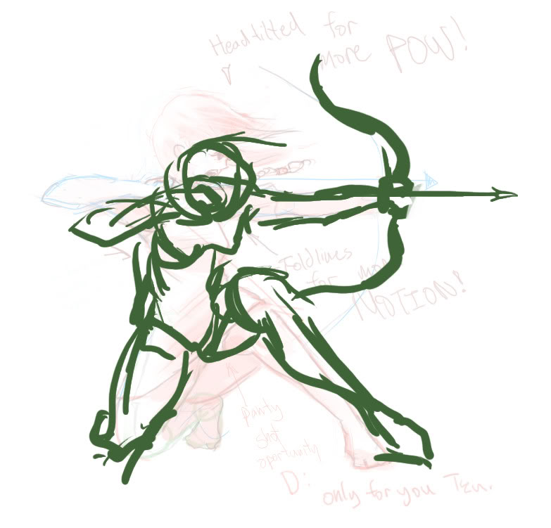
Last edited by Espadon; Aug 05, 2009 at 02:47 AM // 02:47.. |
|
|
|
|
Aug 05, 2009, 02:40 AM // 02:40
|
#17 |
|
Furnace Stoker
Join Date: Jan 2009
Guild: [SOTA]
Profession: D/
|
LOL, panty-shot FTW!
Thanks for the advice, guys, I will definitely keep it in mind. And yes, as an archer, I am aware that it would be an extremely awkward pose (I have tried something like that before while playing with my bow. I fell on my ass while drawing the string back), I just wanted to try to draw something more dynamic than I usually go for, and it was certainly fun to draw XD And sorry for annoying your inner archer by forgetting the arrow, Qing, I knew something was missing but somehow didn't clock what it was. Not the first time I've forgotten a detail like that, either XD Oh, and yeah, go ahead and paintover anything I post for critique. It definitely makes it easier for me to get what you mean. Thanks again guys Nice female Tidus, Tzu Do you know how many people I see cosplay gender-changed FF characters at the cons I go to?
|
|
|
|
|
Aug 05, 2009, 02:45 AM // 02:45
|
#18 | ||
|
Site Contributor
Join Date: Mar 2008
Location: UK/norway
Guild: Order Of The Etherbloom Crown [ZEN]
|
Quote:
I cry every time I see a cactuar with spikey boobs Q.Q About the art, Espadon, I'm a bit too tired to dish out elaborated usefulness, but I had to look twice to see that cloaked character. She/he should stand out a little more. Some of the lighting from the geysir behind her, and from the lamp on her side should illuminate her more, in my opinion. Otherwise I like the creepyness. You could've added some more landscape to it in front of the character, or elaborated the landscape behind her, 'cus Im really curious about how "the rest" looks. I suspect there's not just one geysir there, considering the fumes and such. Quote:
|
||
|
|
|
|
Aug 05, 2009, 02:52 AM // 02:52
|
#19 |
|
Krytan Explorer
Join Date: Mar 2008
Profession: N/
|
It's valid point, where does style end and simple mistakes begin? An arm coming out a forehead is usually going to be a mistake, but style it is something I am wary of passing comment on.
Oh, and I totally avoided the panty shot opportunity because I wasn't going to get into the anatomy of panty shots. Reference material for that folks. |
|
|
|
|
Aug 05, 2009, 02:56 AM // 02:56
|
#20 |
|
Lion's Arch Merchant
Join Date: Dec 2007
Location: USA [GMT -5]
Guild: State of the Nolani [gusy]
Profession: A/
|
I've never tried shooting an arrow, but I've tried to straighten my spine with my legs in that position and it hurts like hell [and the current revision state just looks awkward]. Something needs to be changed regardless.
Arm is not coming out of head since when you lean forward your head... Gogo pose mannequin check. IMO bad to CnC wips like this because your intentions are hard to figure out. You could as well want to do pic reminiscent of ancient Egyptian figures and have us end up giving crits in the wrong direction? Last edited by Espadon; Aug 05, 2009 at 03:02 AM // 03:02.. |
|
|
|
 |
|

«
Previous Thread
|
Next Thread
»
| Thread Tools | |
| Display Modes | |


 Linear Mode

|
|

All times are GMT. The time now is 07:20 AM // 07:20.
